2019 Year in Review
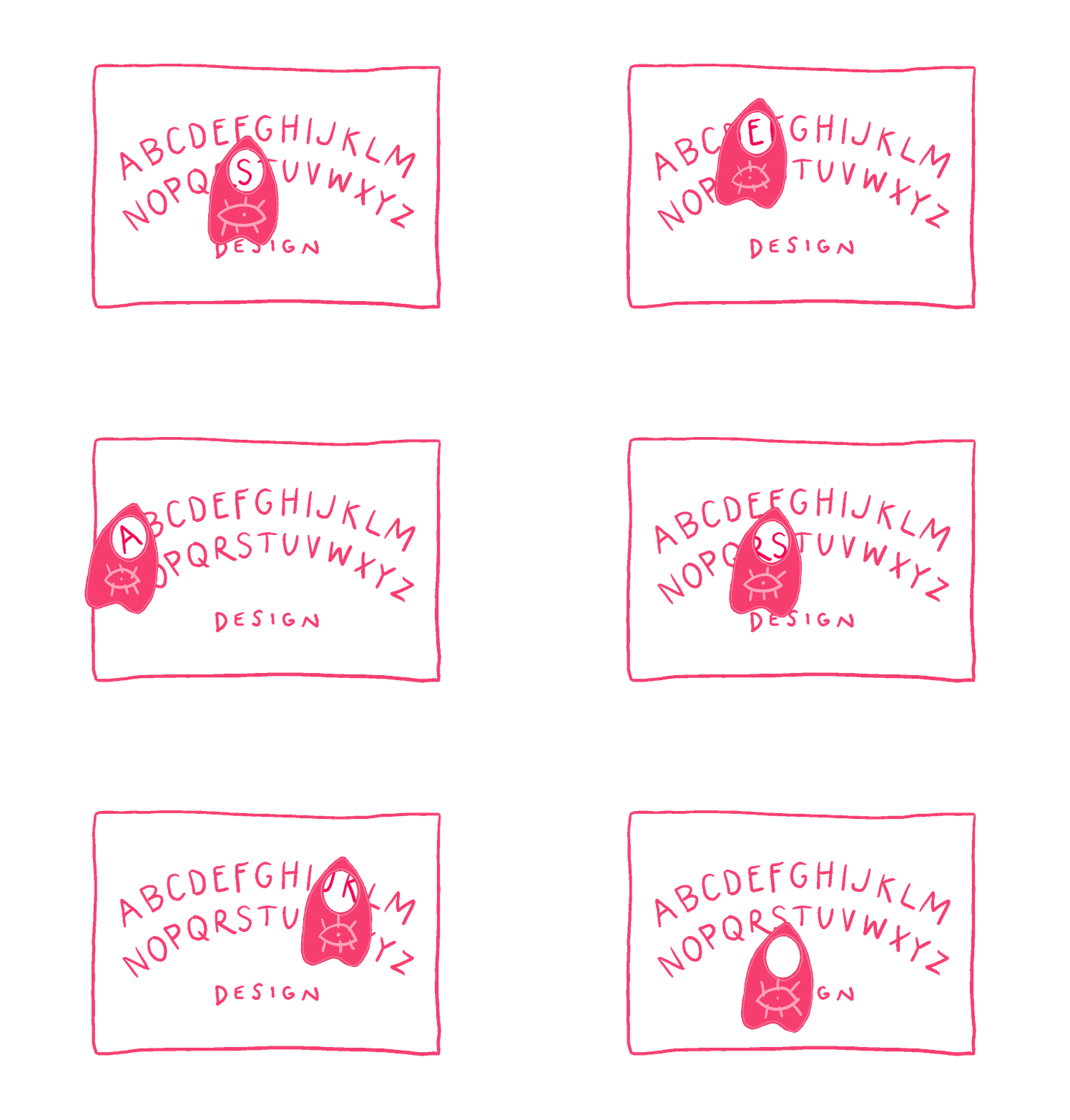
This was one of the last projects I worked on at Rauxa—and what a great project to go out on! I designed the email (two versions, one personalized and one generic) and landing page experience, including all of the animated gifs along the way. Whichever version of the email a guest received, we wanted them to feel like they are getting a totally unique experience, with fun winks to Alaska’s personality along the way.
Abandon Cart Series
Goal
Abandon cart/browse emails are kinda a no brainer for any email program, but Alaska Airlines' triggered sends were looking outdated and weren't getting people excited about the destinations they were browsing. We know that many flyers will research and compare multiple airlines when they're planning a trip, so it's important to get them back into their purchase if they click away.
Approach
On this project, I worked closely with our strategists to determine what content would make this email useful to the customer at this stage in their journey. The largest shift we made was taking the focus off of the flight they looked at and onto the location, making them want to hurry up and book that trip. Alaska Airlines commissioned artist Erik Marinovich to make 60+ unique hand-lettering marks for their most popular locations, but at the time were only using them on napkins in flight. I paired these city names with local images that I sourced for each city so that customers would get a personalized experience in their email.
Results
Since launching these new abandon cart/browse emails, bookings from the email increased +167% quarter-over-quarter and engagement increased +41% QoQ.
And we won an effie for this! Woo hoo!
Fare Alerts
Goal
Fare alerts are a weekly send with the best fares from a flier’s home airport. I wanted to make the fares easier to read, mobile-friendly, and better align to the site experience.
Approach
Design-wise, I explored a few visual approaches and ultimately presented two concepts. We ended up using both options, one for regular fare alerts and the other for live, in the moment fares using EveryMundo. For the redesign, our team also made adjustments to the segmentation and started sending to a larger audience.
Results
The redesign and updated audience led to +63% CTOR and a +128% increase in revenue.
E-Statement
Goal
E-Statements are a monthly email sent to Mileage Plan members with their current available miles. With the redesign I wanted to make this email more useful to the user and give it a more modern look.
Approach
I explored a number of visual approaches, including the one we ultimately went with. The design system I created for this email has greatly influenced the larger redesign of the overall email series. Along with coming up with the look of the email, I worked closely with strategy to ensure that the content was relevant to each member based on how many miles they have. Since updating, we’ve simplified that segmentation based on performance.
Results
+10% CTR on lower segments, +155% CTR on segments with higher miles balances.


